

The stock market had a rough week, and it sent me back to a chart I have wanted to extend for sixteen years.
I first saw it in 2010, as junior faculty at the University of Maryland, in a departmental colloquium by my colleague Victor Yakovenko, a condensed-matter physicist there. The talk drew on a 2009 Reviews of Modern Physics paper he had just written, and on something he had noticed in the IRS income tables a decade earlier. The incomes of most Americans — roughly the bottom 97% — follow an exponential distribution. That is the same law, called Boltzmann–Gibbs, that describes how energy spreads among the molecules in a gas. And it shows up for the same reason: money, like energy, changes hands in many small transactions, and the total is conserved. A gas has a temperature. So does this distribution. Its "income temperature," T, is just the mean income of that ordinary population.
Note that the shape of this distribution has not changed in forty years. Only its temperature has risen, mostly with inflation.
The top few percent are a different population. Their incomes follow what is called a Pareto power law, because investment income compounds in percentages rather than growing by raises. Put the two groups on one plot and you get a two-class structure, with a visible kink where one gives way to the other.
The chart I wanted tracks one quantity, and it is simple. Take the mean income of all tax filers, ⟨r⟩, and subtract the temperature T of the exponential. The difference, as a fraction of the mean, is the share of national income that the power-law tail captures beyond what the ordinary wage pattern would produce on its own:
f = 1 − T/⟨r⟩
In 1983, f was under one percent. In 2023, the most recent year the IRS has released, it was 24%. In between, it spiked and crashed four times: the late-1980s boom (partly a reporting artifact of the 1986 tax reform), the dot-com bubble (21% in 2000), the housing bubble (25% in 2007), and the pandemic asset boom, which pushed f to 33% in 2021 — the highest value on record.
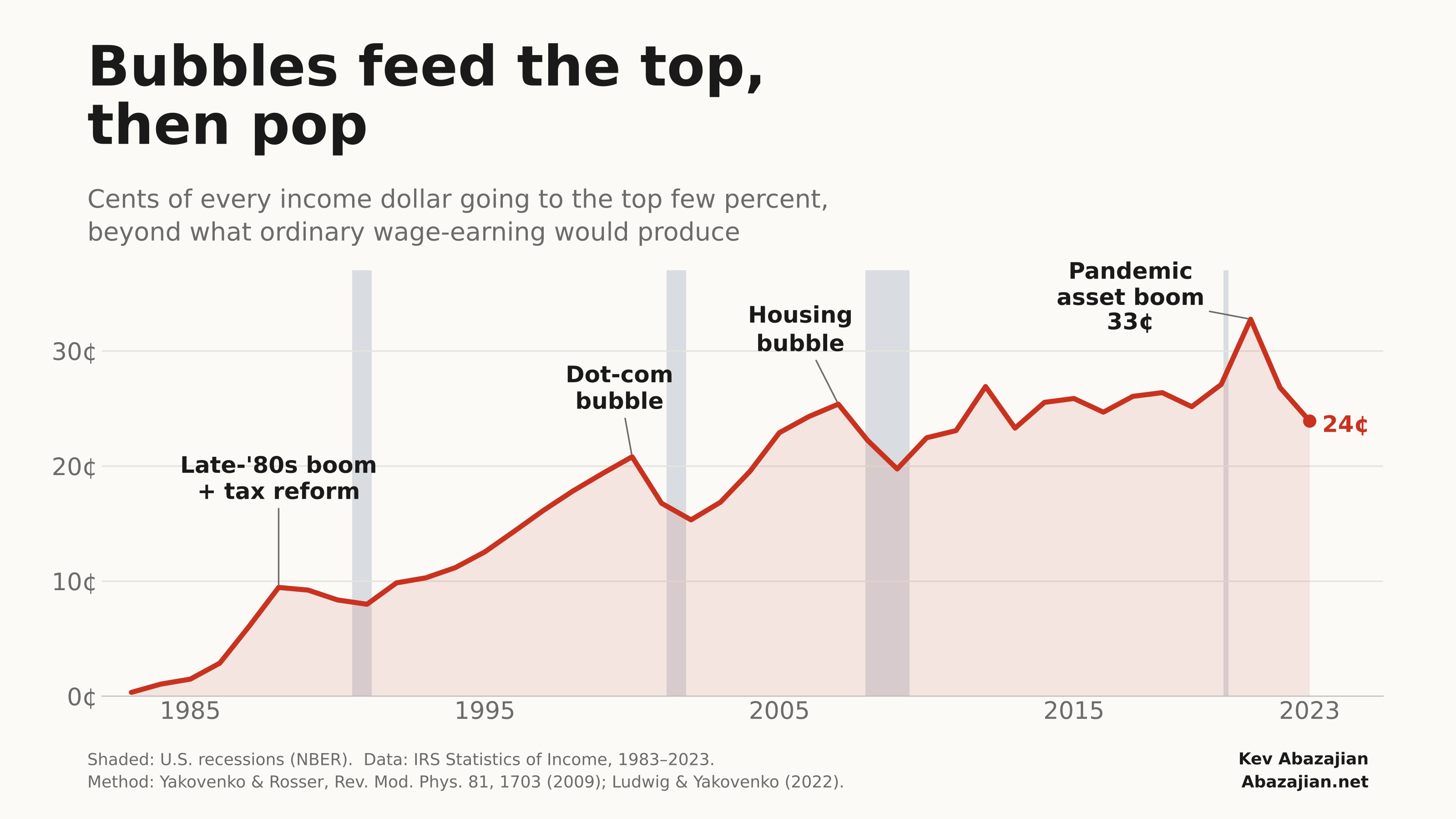
Recessions are shaded. Three of the five peaks came one to two years before one. Two did not, and the 2020 recession arrived with no peak ahead of it. So this is not a recession forecaster, and I would not trade on it.
What it does measure is how much of the nation's income is riding on asset prices rather than wages. When a bubble inflates, that share rises. When it pops, the share falls — and the exponential bulk is untouched either way. The ordinary economy does not feel the bubble on the way up, and it does not get the gains back on the way down.
The IRS tables run two years behind, so where f stands today is anyone's guess. Given what markets did in 2024 and 2025, I would not be surprised if it has climbed back toward the 2021 record. We will find out in 2027.
The method is Yakovenko and Rosser's (Rev. Mod. Phys. 81, 1703, 2009), with the fitting procedure from Ludwig and Yakovenko (2022), who carried the series to 2018. I extended it to 2023 using IRS Publication 1304, Table 1.1, and reproduced their temperatures exactly for every overlapping year. Data and code are available on request.
—
Note: code development and text was initially drafted by Claude Fable 5.1 under my detailed direction. I then edited the text as well.